The Performance Agency
Brand Strategy
Redbeerd
Brand Development
Redbeerd
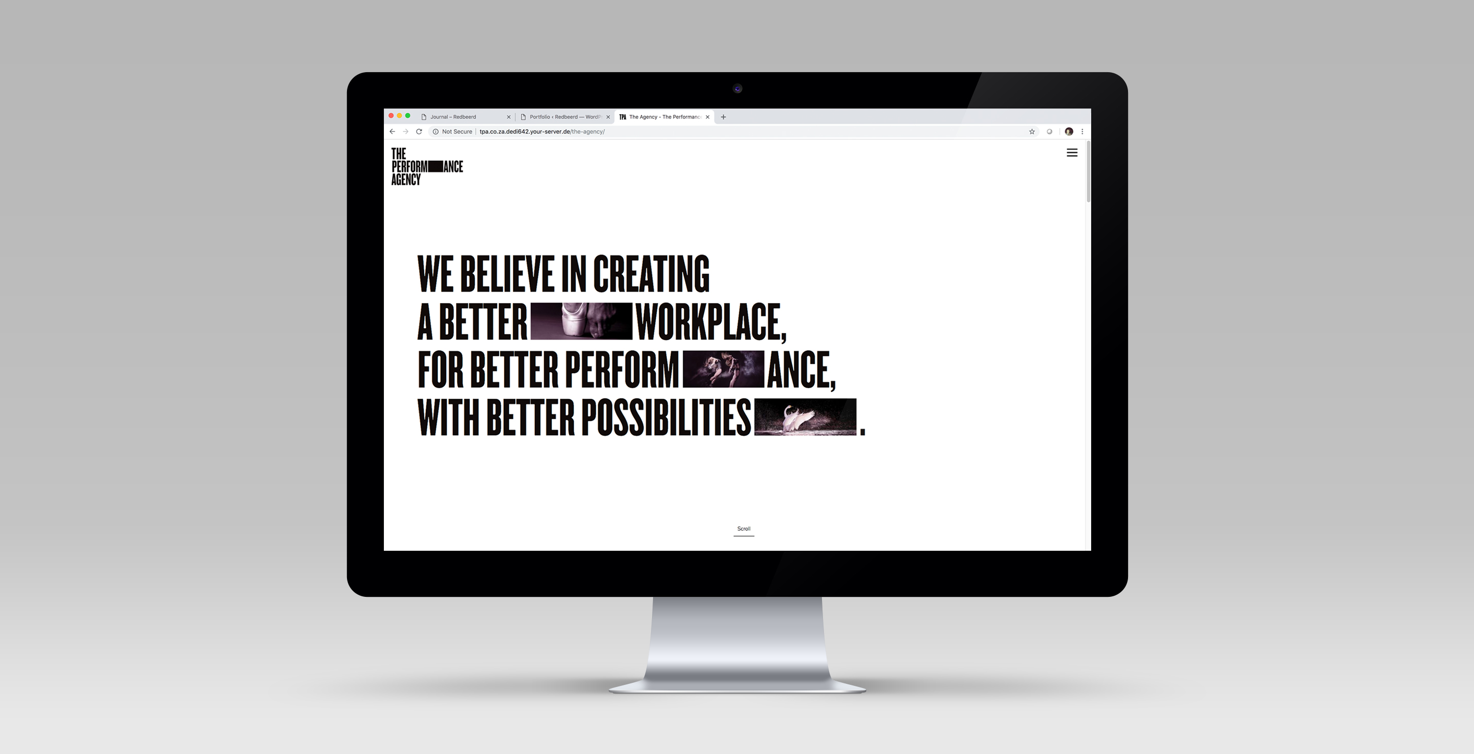
Website Design and Development
Redbeerd
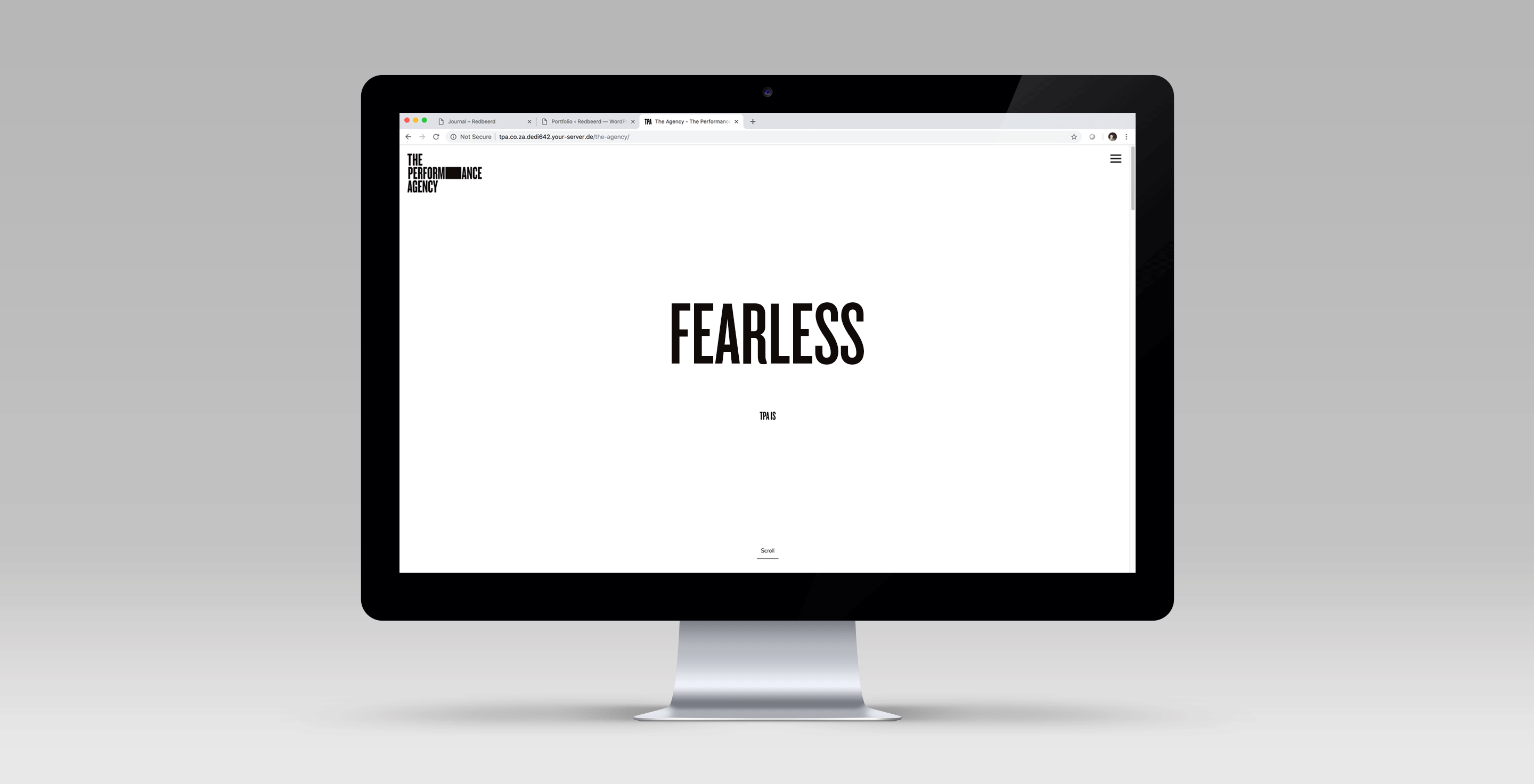
The Performance Agency is a creative performance agency run by an inimitable team determined to transform the landscape of business. Inspired strategy, culture change, leadershifts and a human perspective set TPA apart from the common consultancy. They needed a gutsy brand to bring their vision to life.
theperformanceagency.co.za
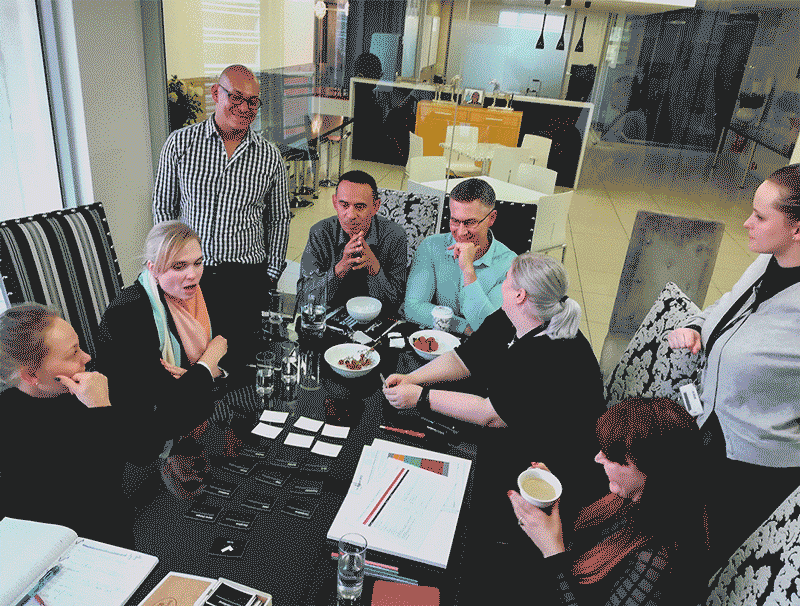
Workshop
The process kicked off with a creative workshop with TPA’s leadership team. A day of activities, exercises, games and heartfelt expressions of intent allowed us to understand the company as a whole and its people; where they have come from and where they wanted to go.
Research
After clarifying workshop feedback, conducting experiential research at the TPA workplace, working alongside the team on a number of projects, and attending some exceptional events held by the company, we were (almost) ready to put pen to paper.
Brand. And repeat
Articulation of intent is never easy. Tens of logo iterations were created to uncover the best possible visual for a brand as direct, intuitive, adaptive (and often paradoxical!) as TPA.
Questions we asked ourselves:
How do we establish independence and maintain flexibility?
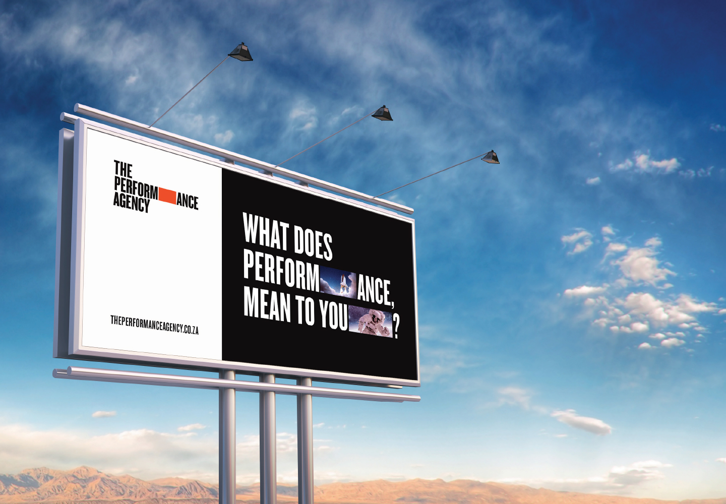
How do we allow for different interpretations of performance?
How do we introduce a brand that creates a conversation?
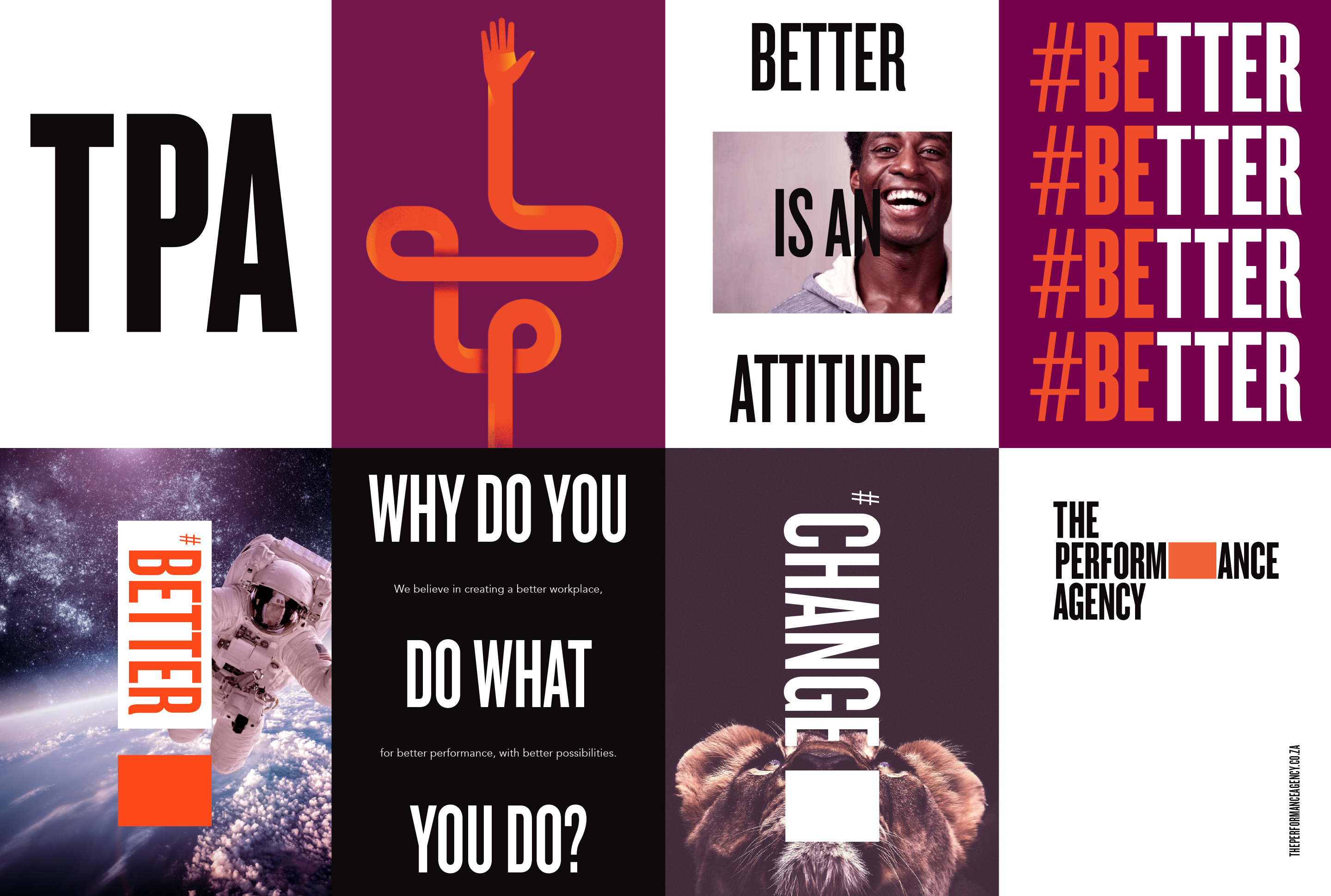
Shaping performance
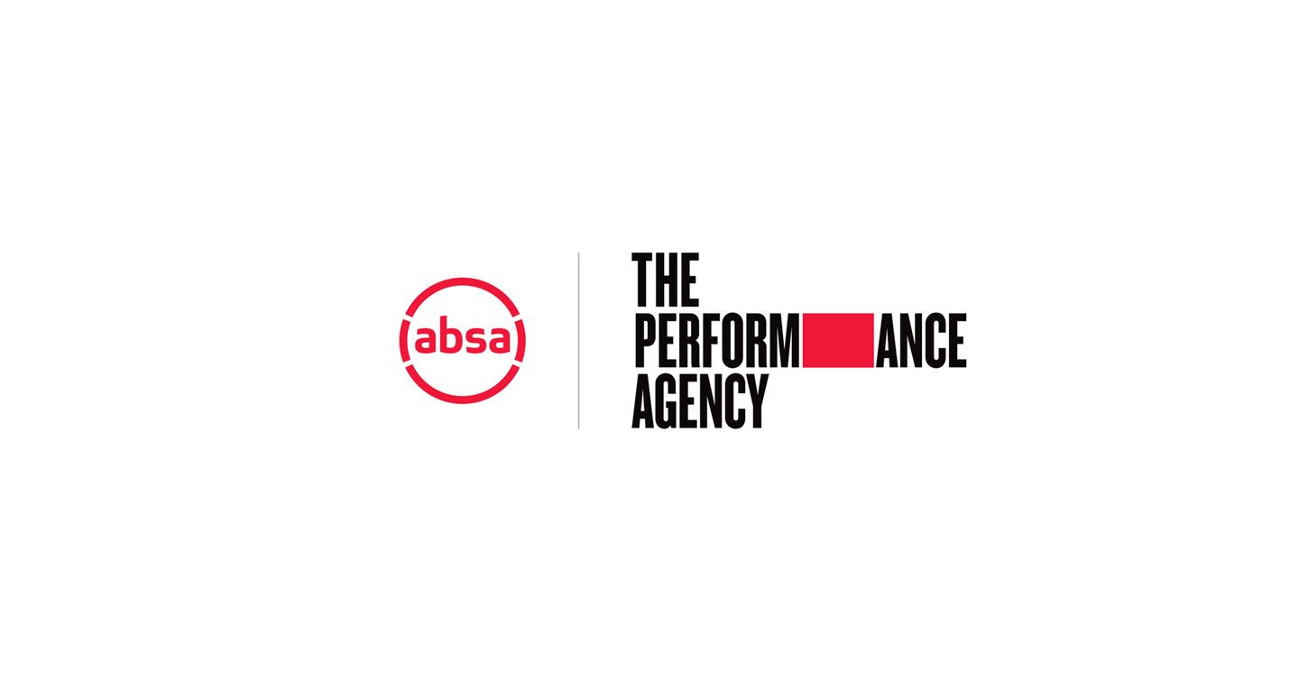
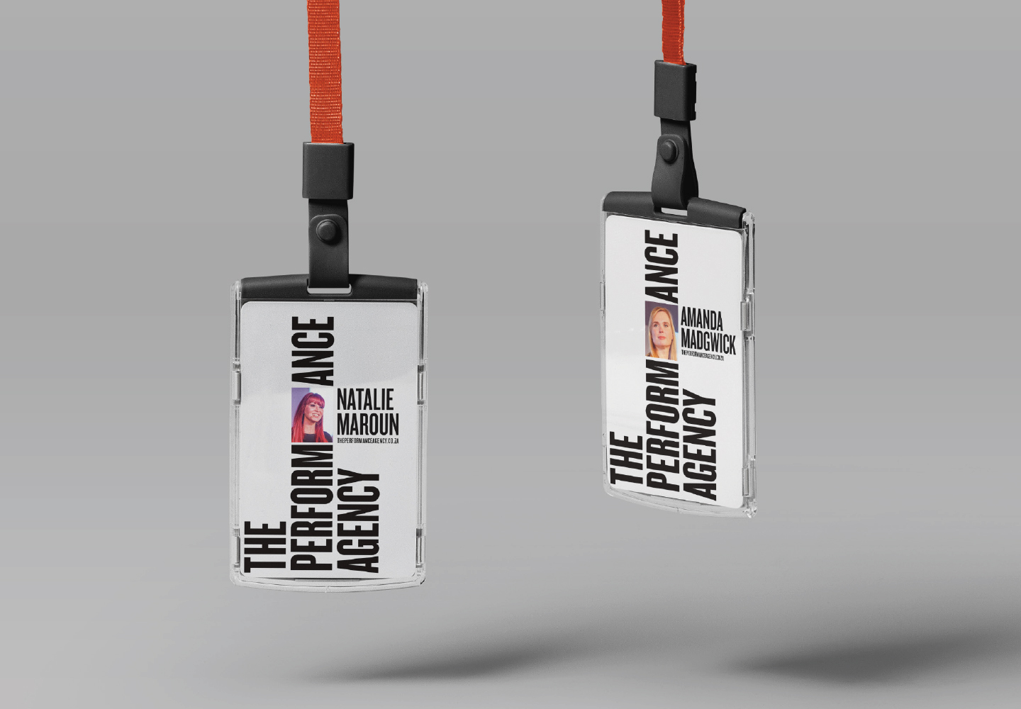
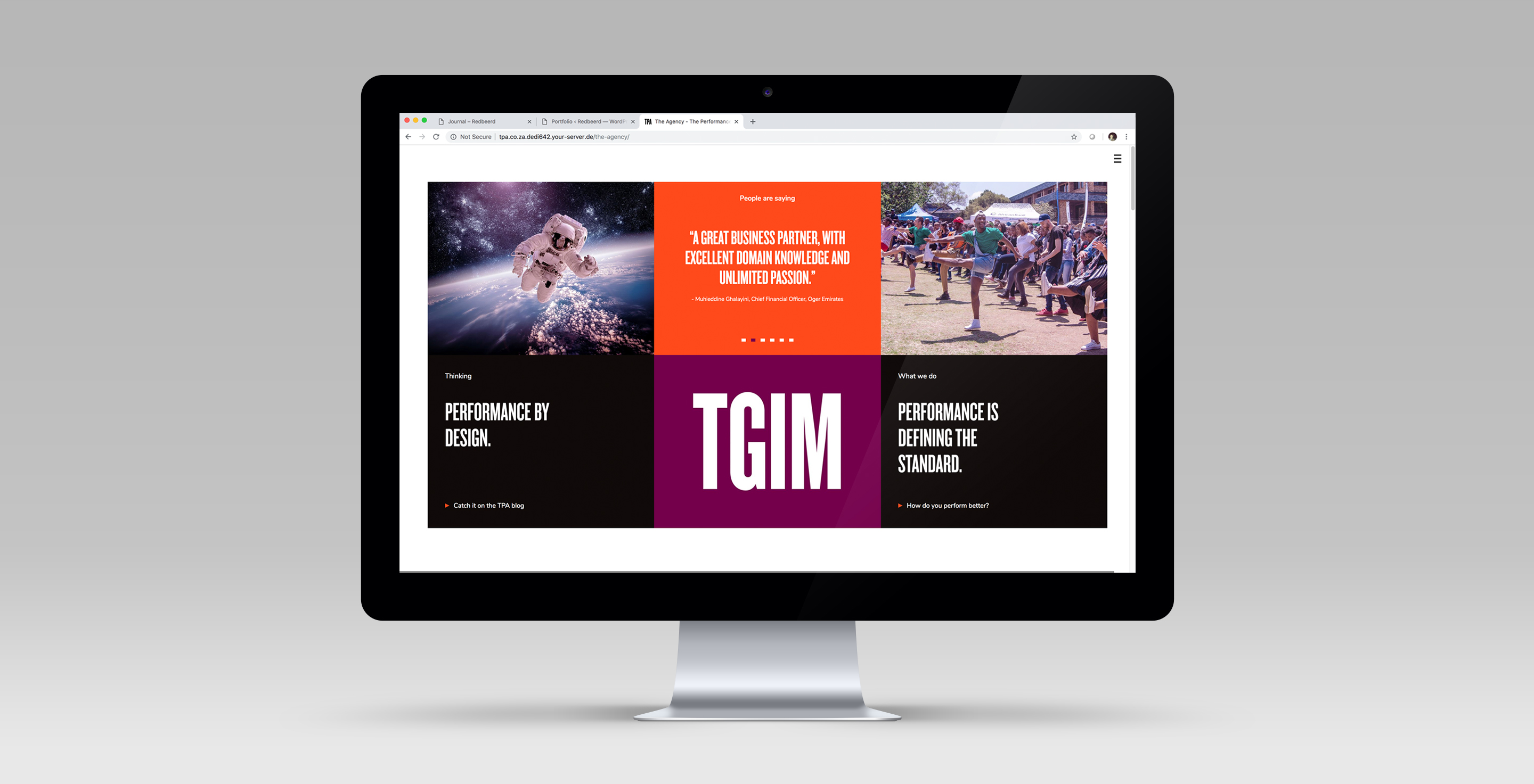
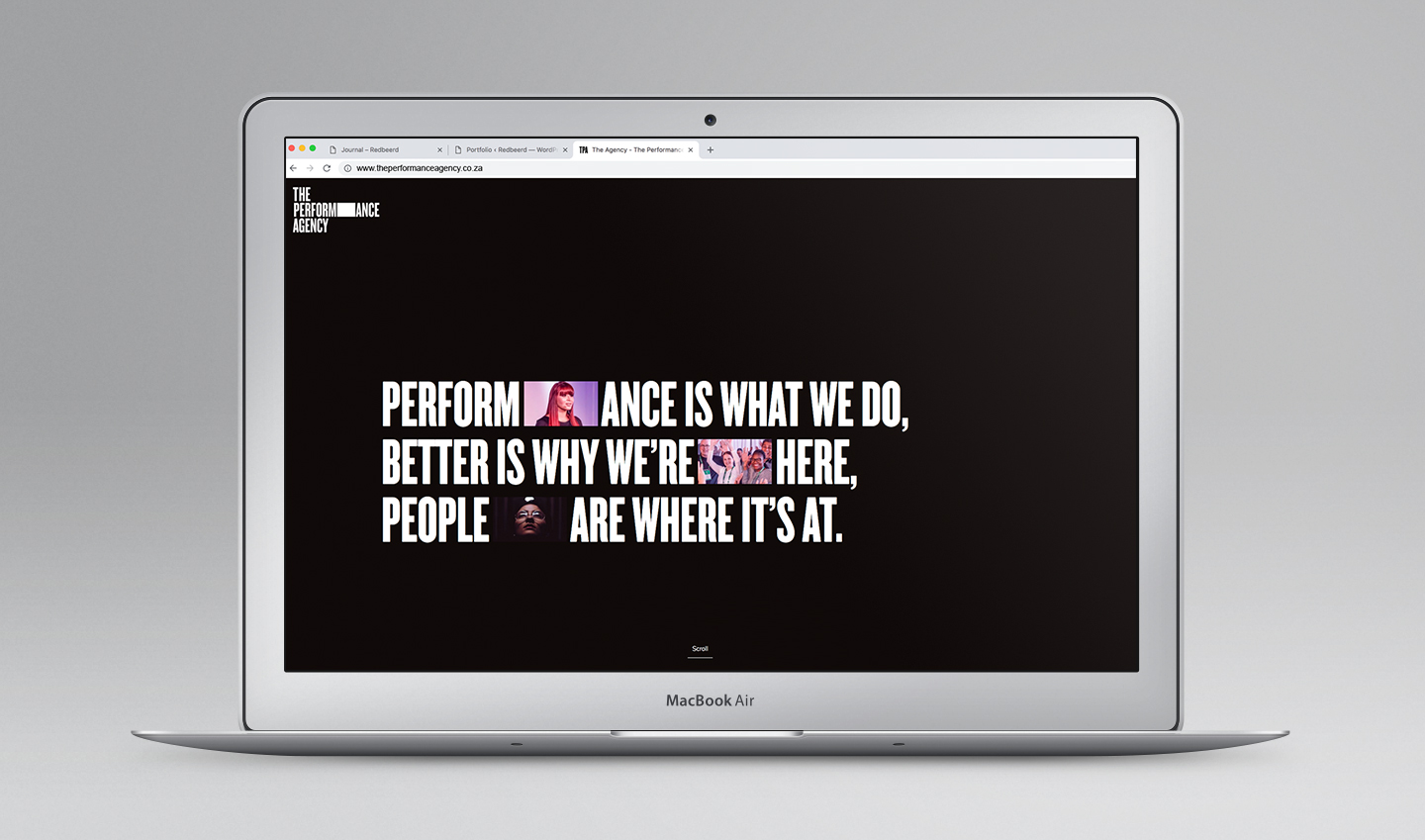
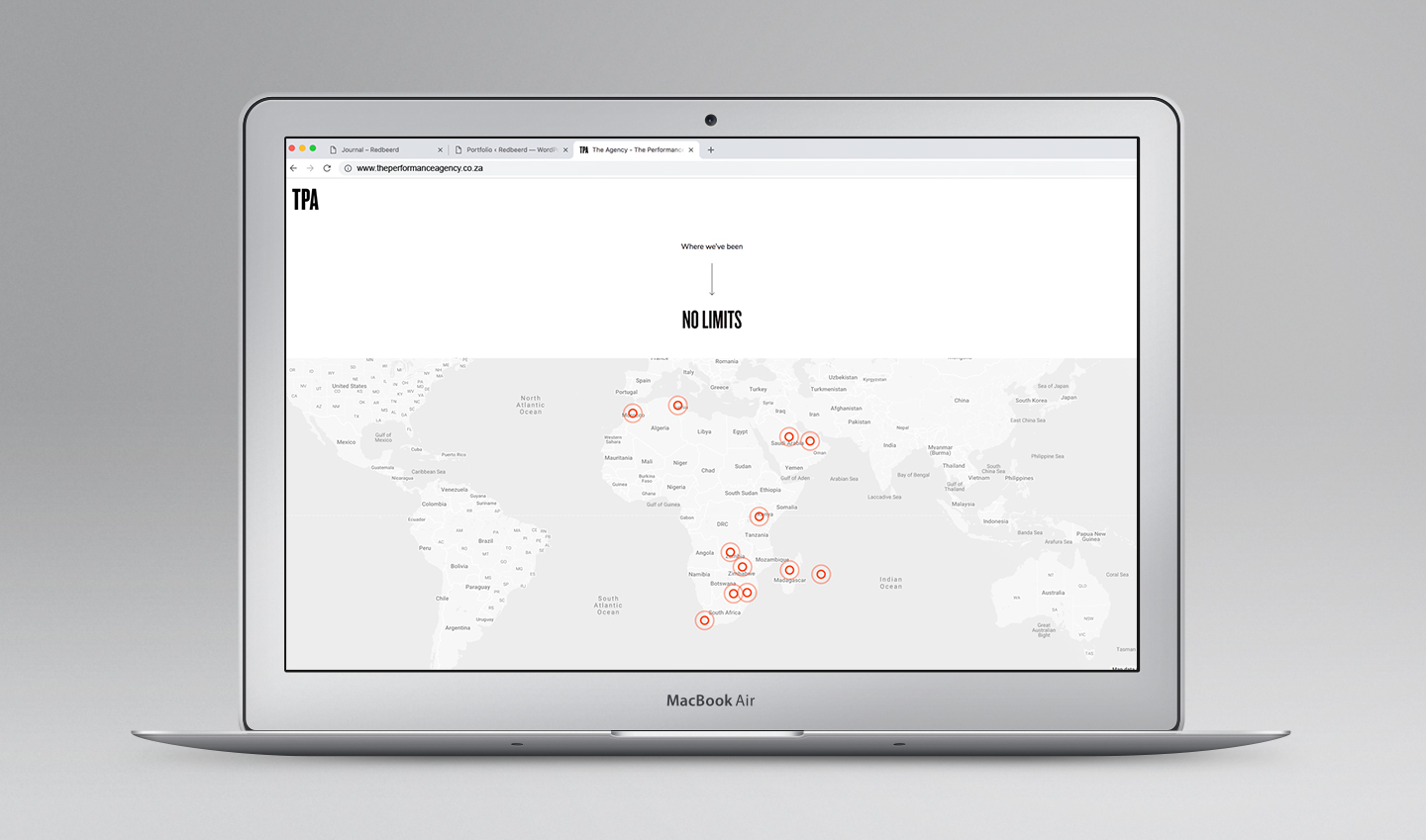
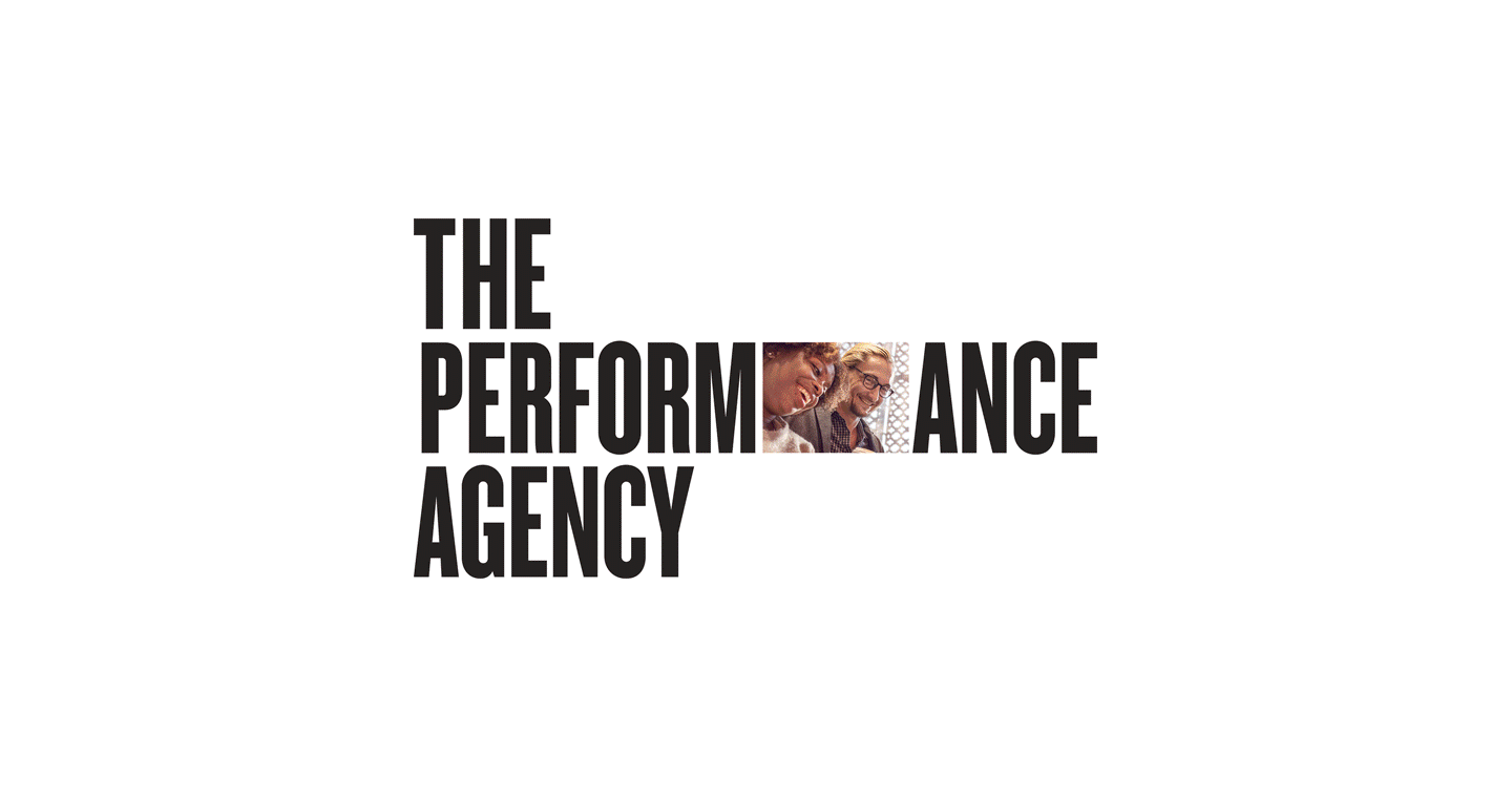
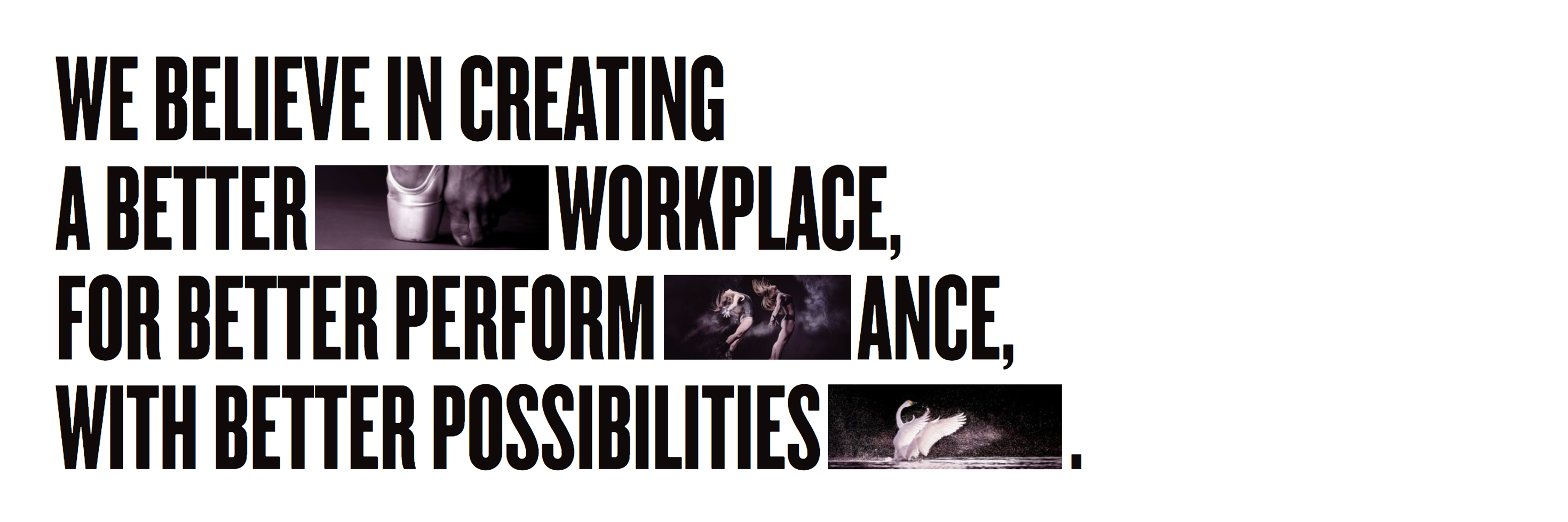
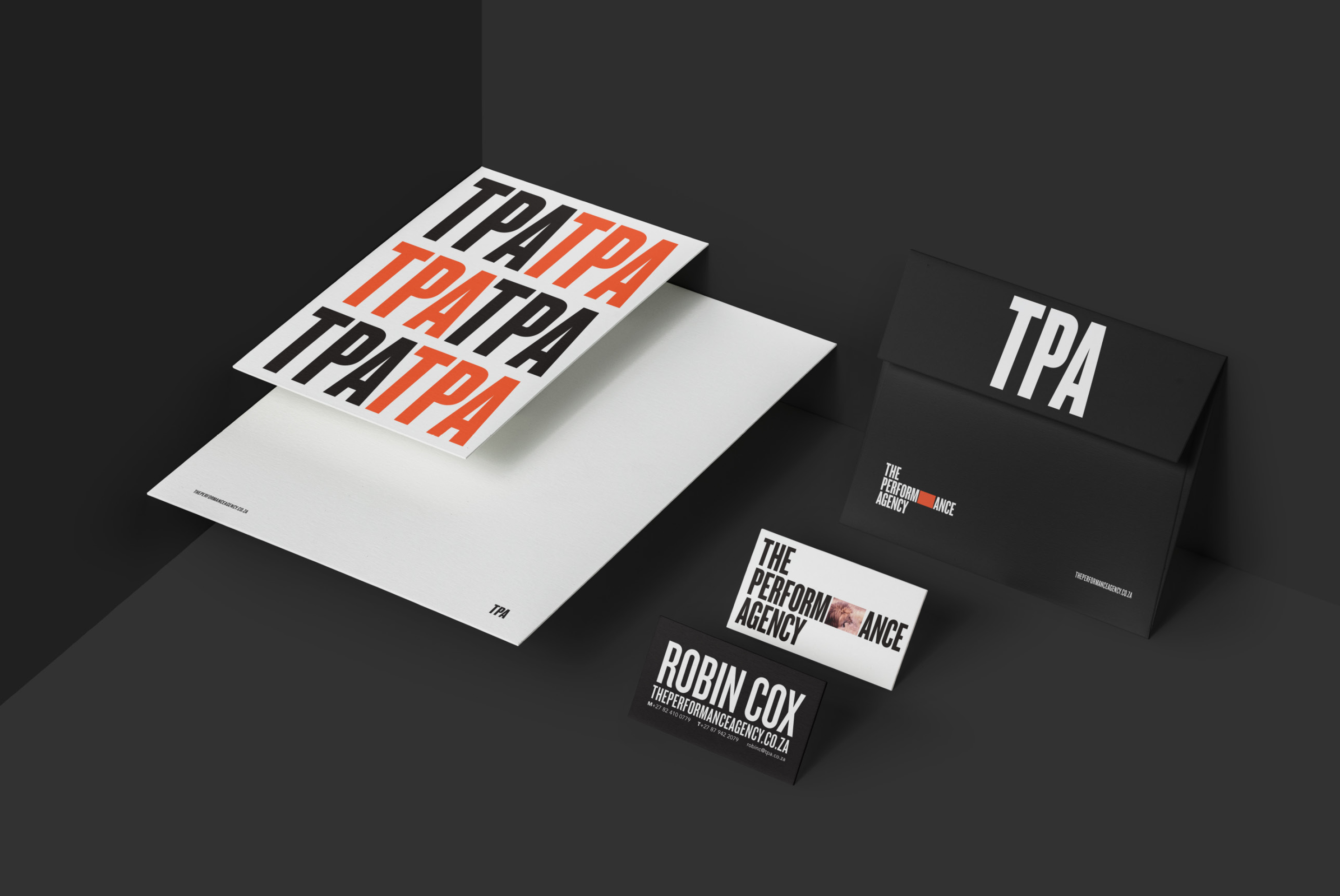
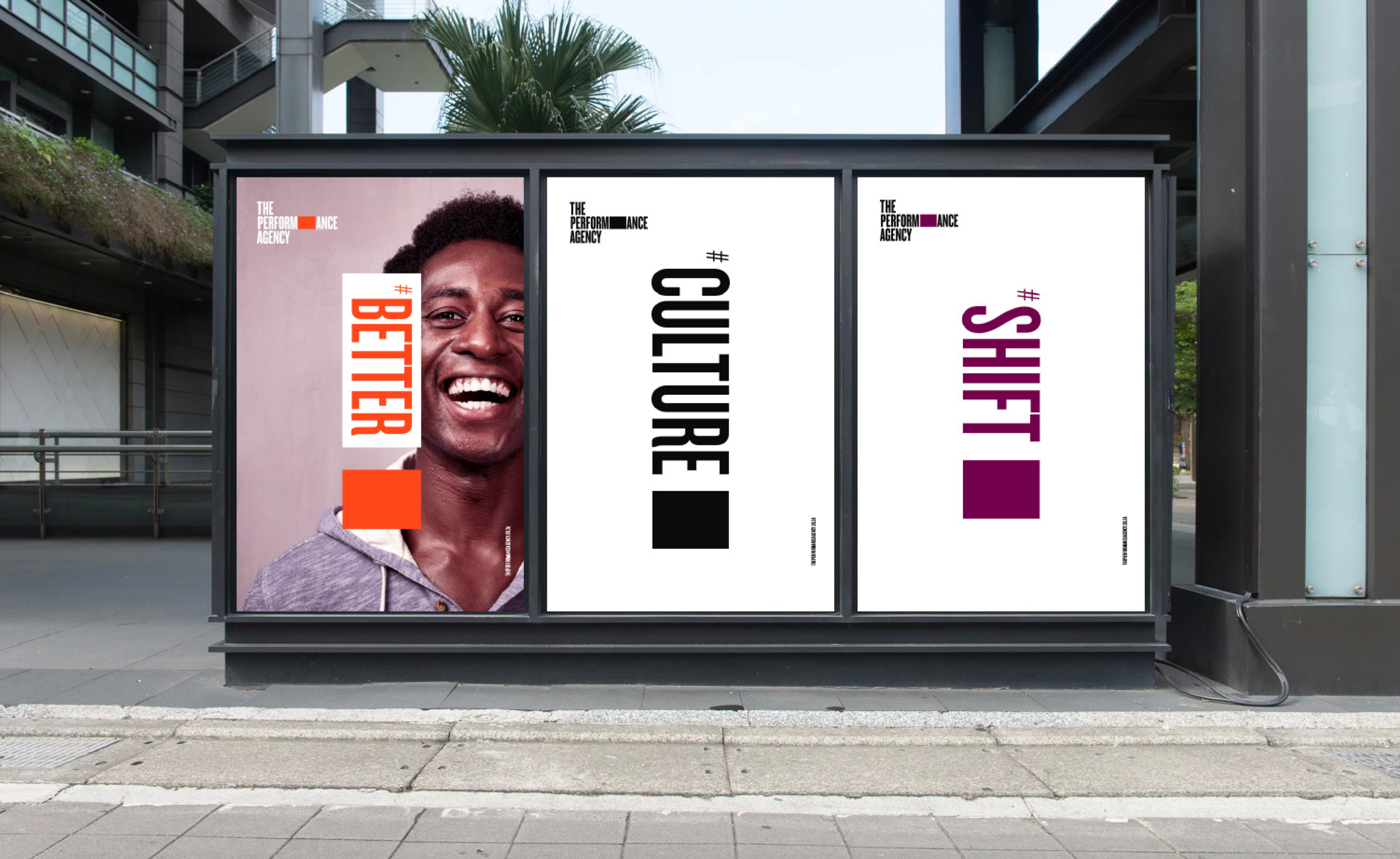
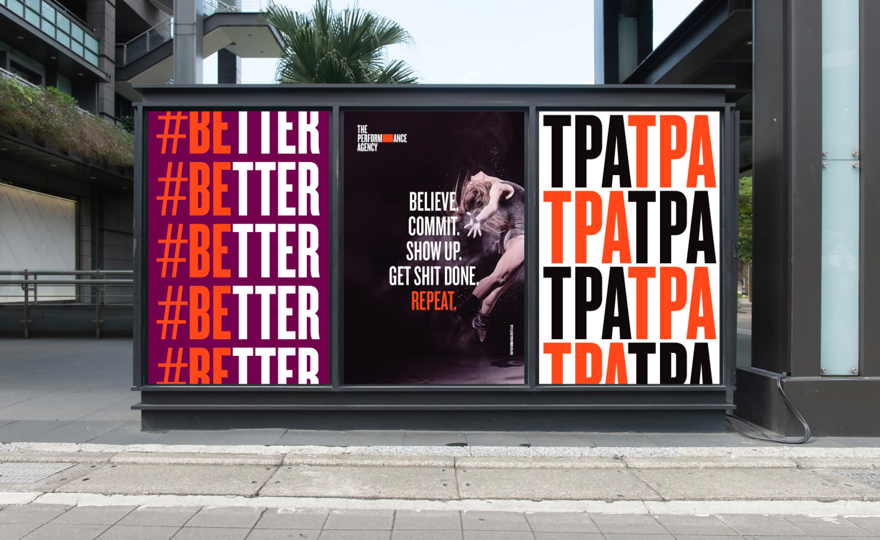
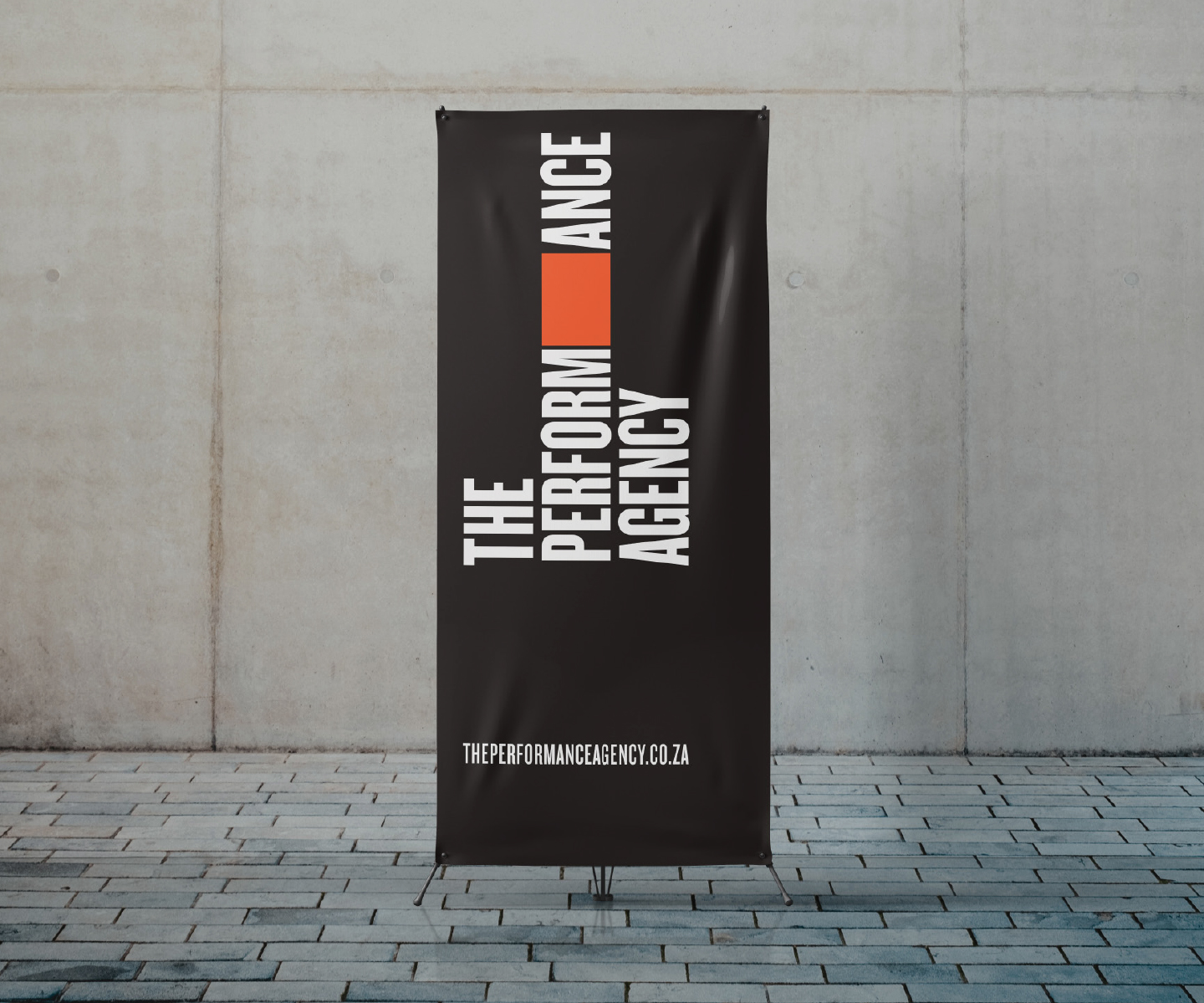
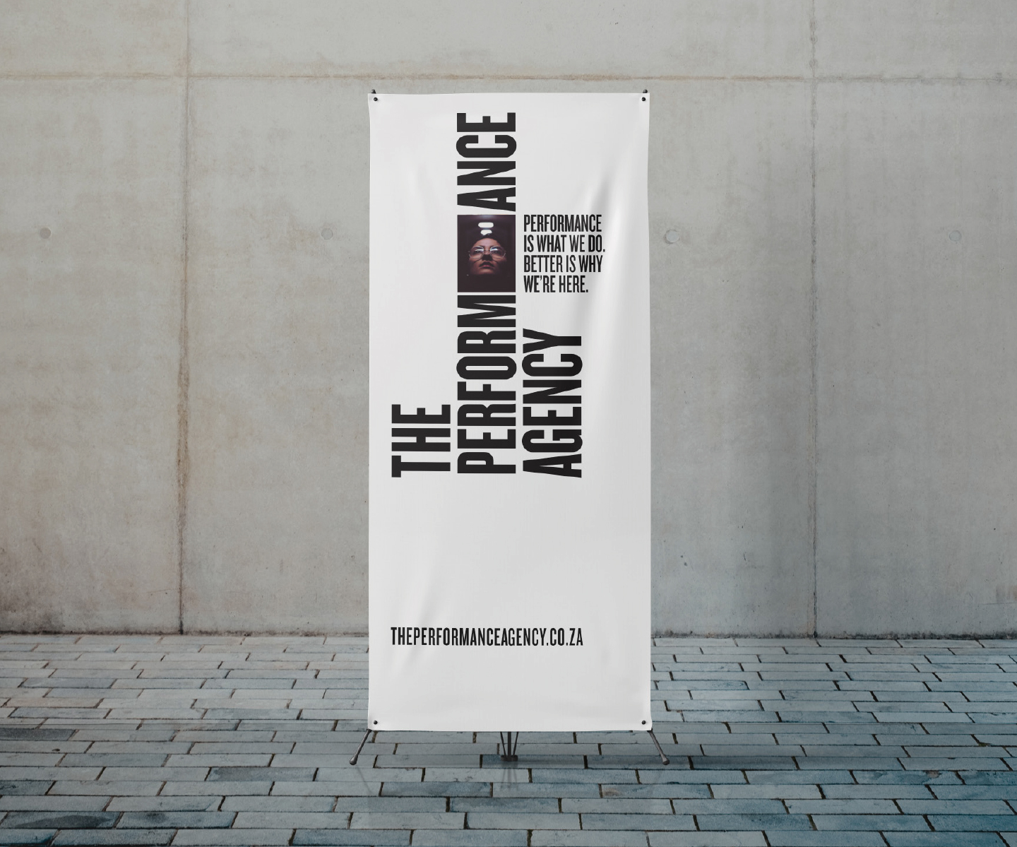
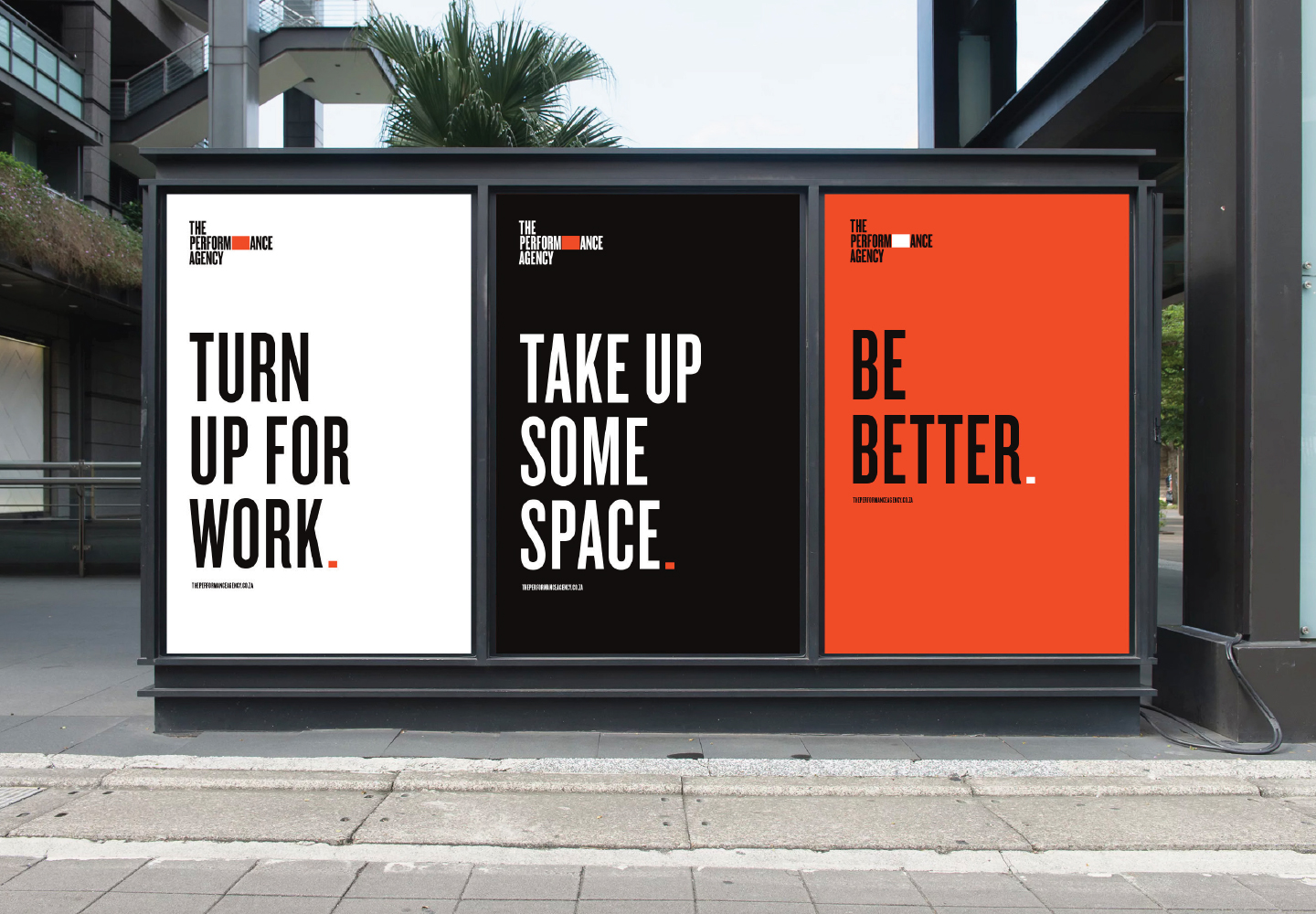
Now, TPA has potential written into its DNA and change configured into its movements. The logo window is an aperture, reflecting performance, #Better, culture and all those who work for and with TPA.
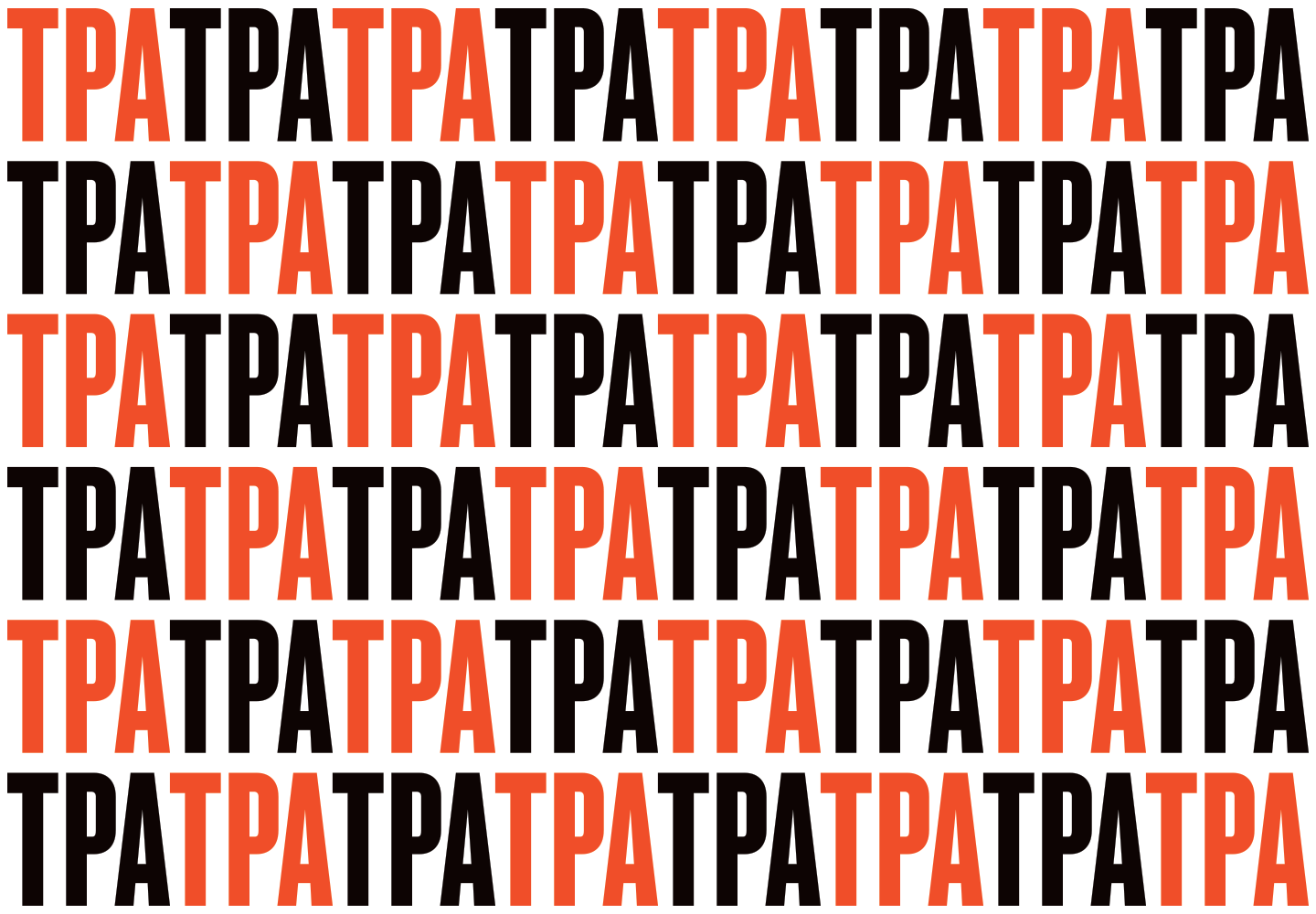
The primary logo and its secondary logomark, TPA, are potent and energetic, never quite standing still. Just like the company itself.
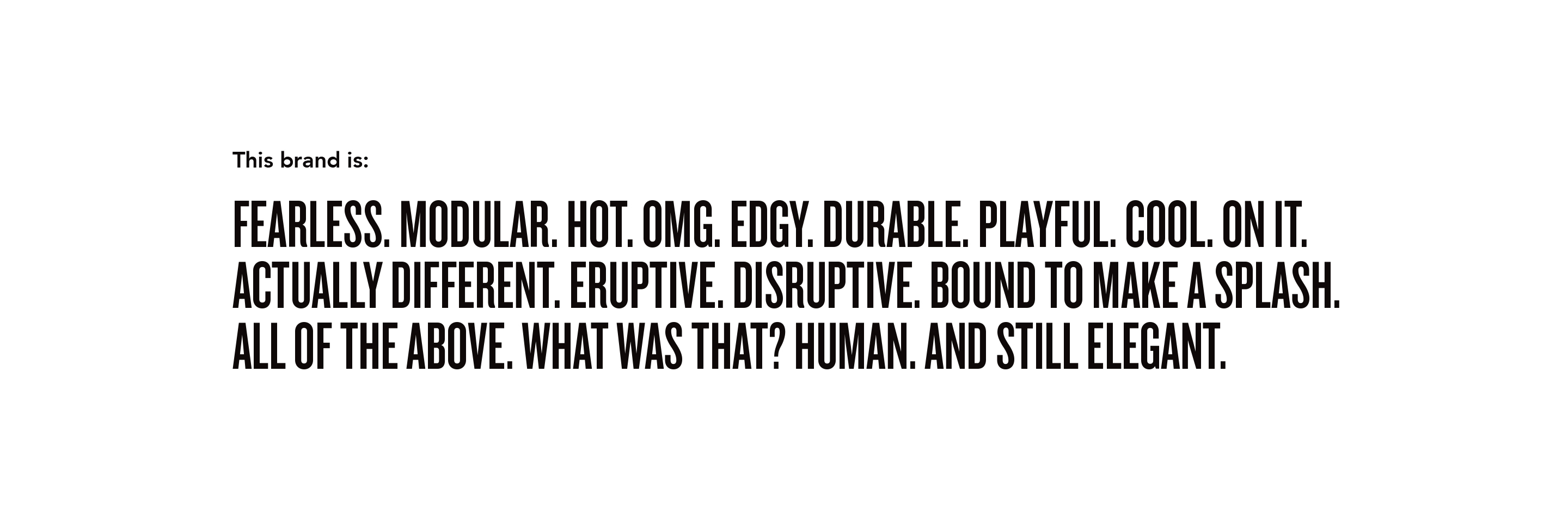
Now you’re talking our language
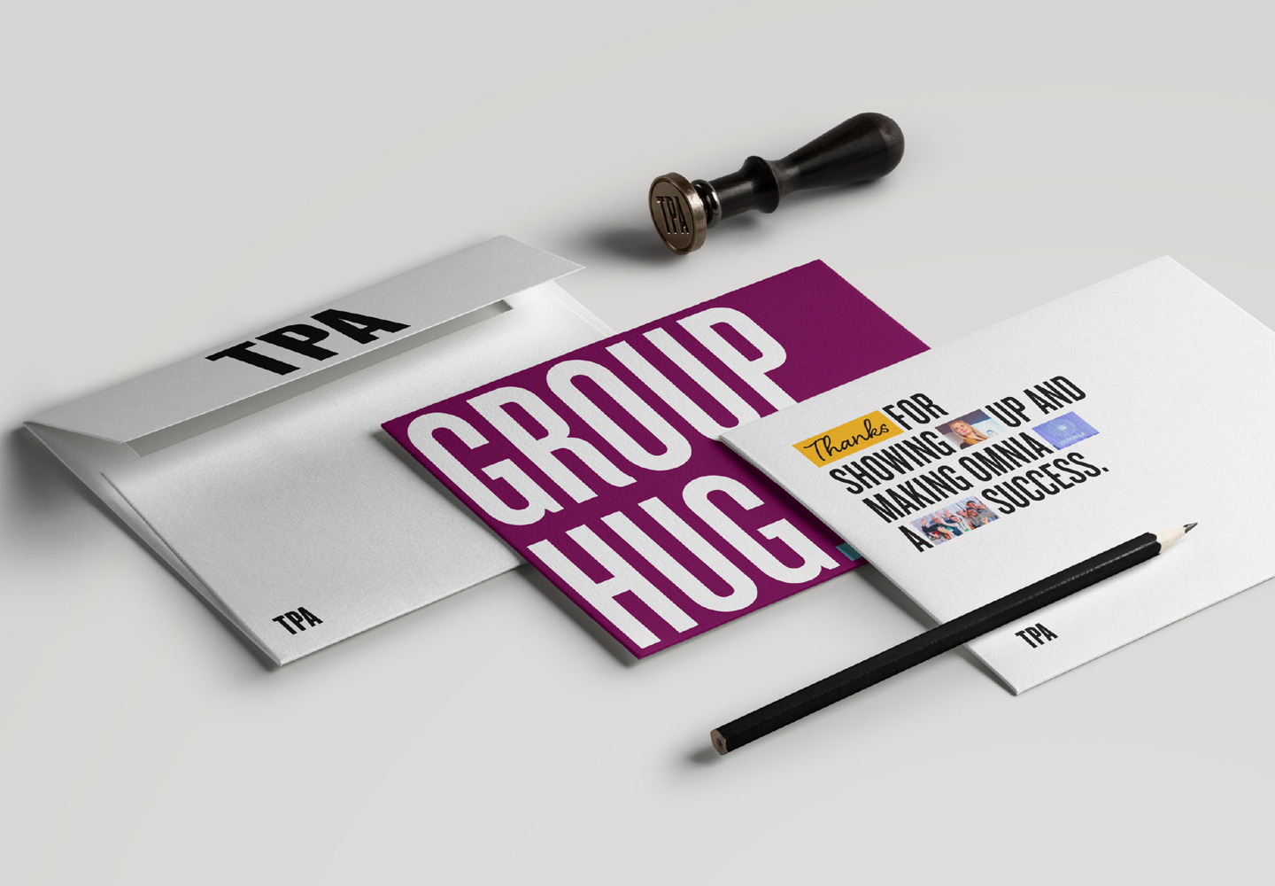
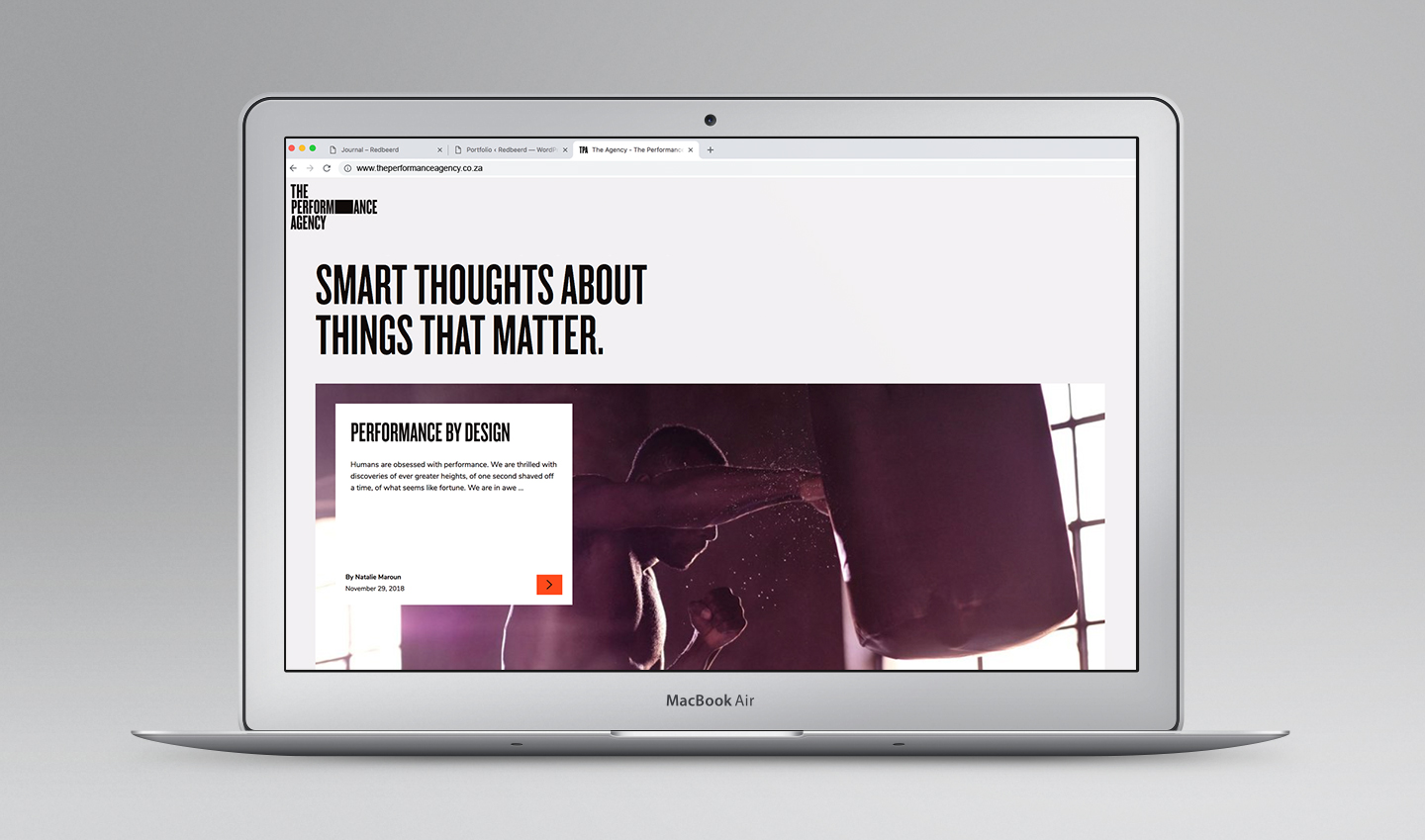
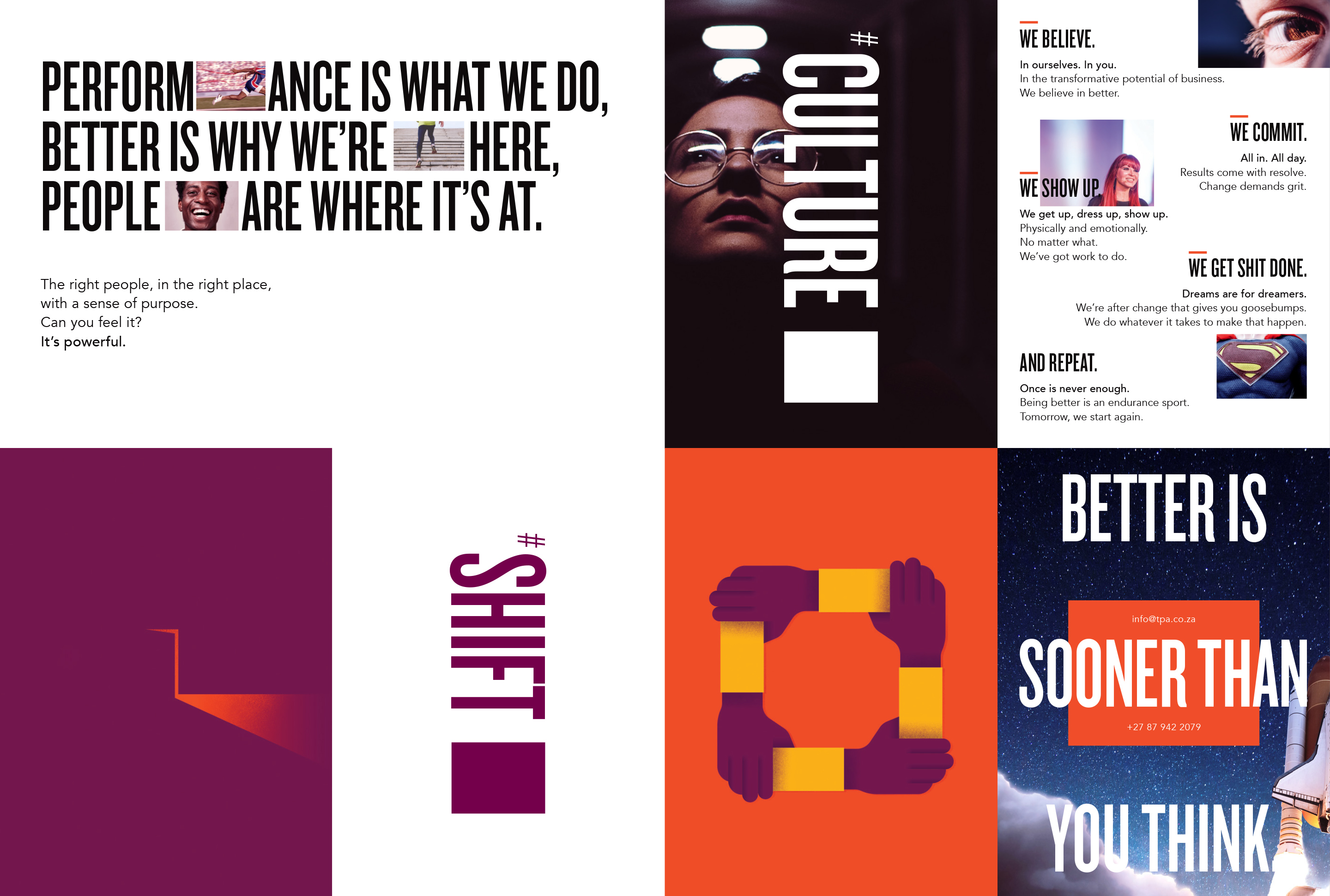
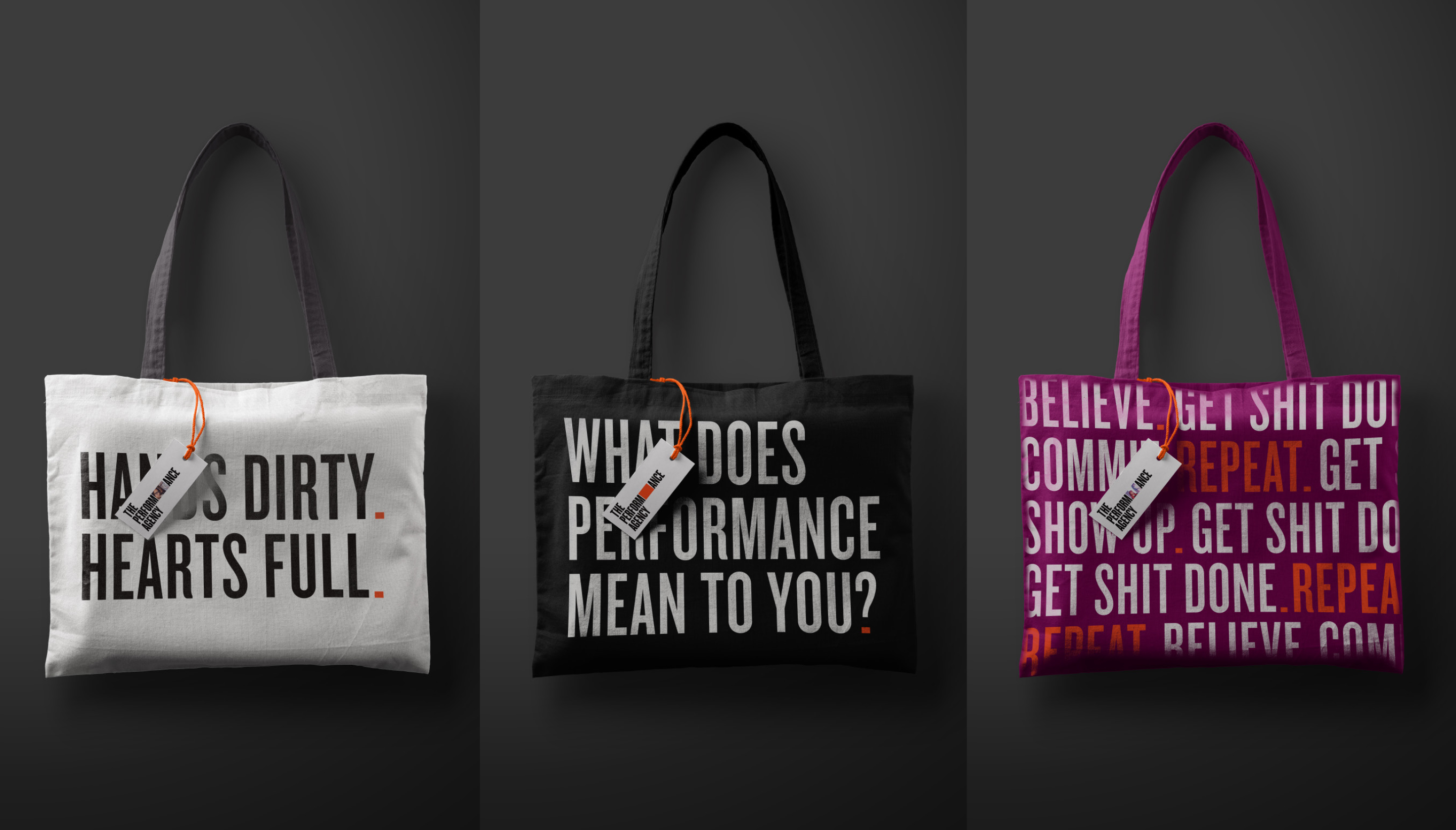
Photography, typography, illustration, story. Visual and verbal language balance each other to communicate an ethos and a brand that is at once robust and sensitive, edgy and accessible, fearless and vulnerable.

Look twice
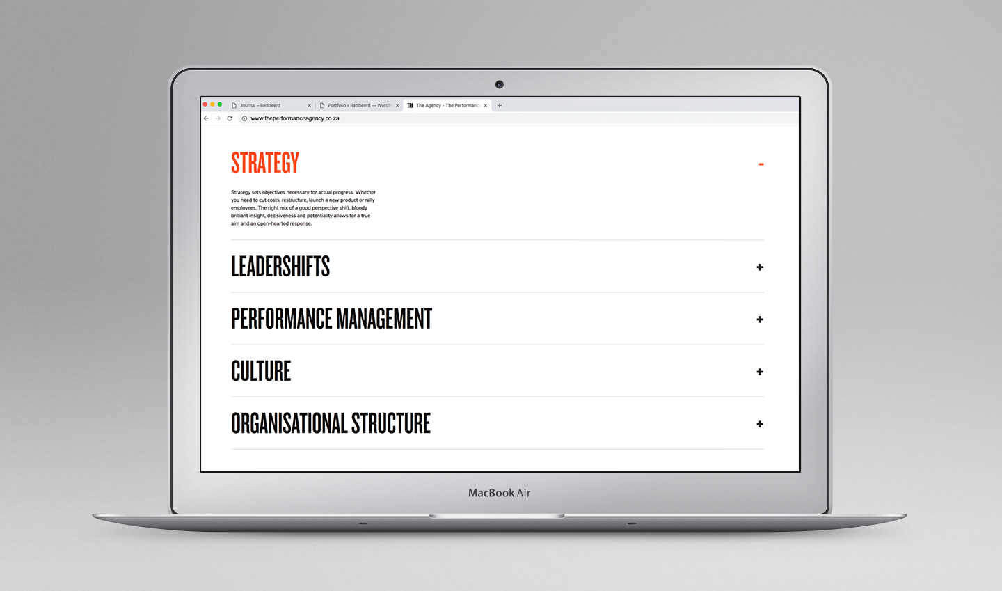
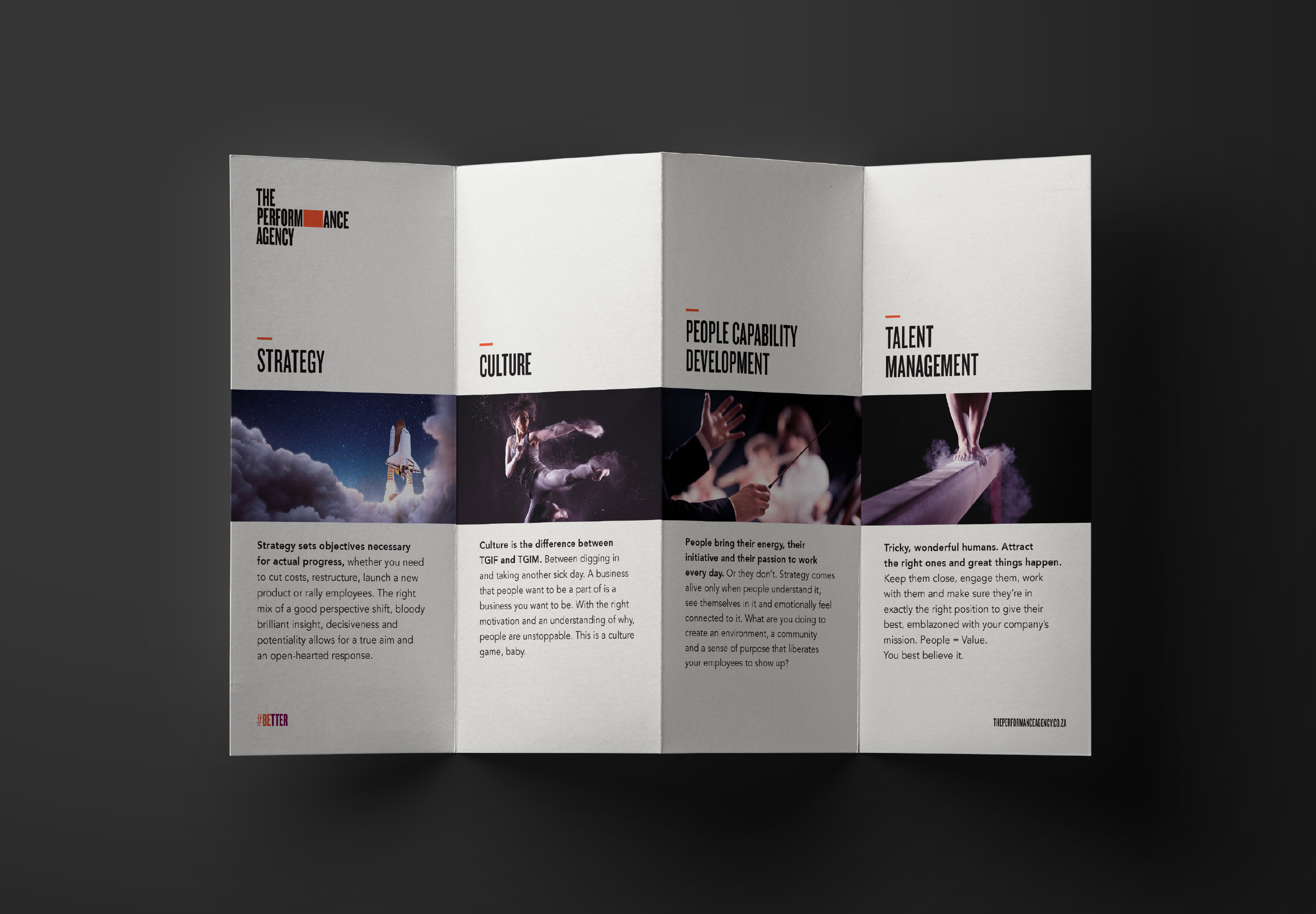
Typography is chosen for form and significance. Knockout, named after boxing weights, is authoritative, self-assured, clan-like and committed. It is balanced by Avenir; humanist, approachable, with the added bonus of meaning future in French.
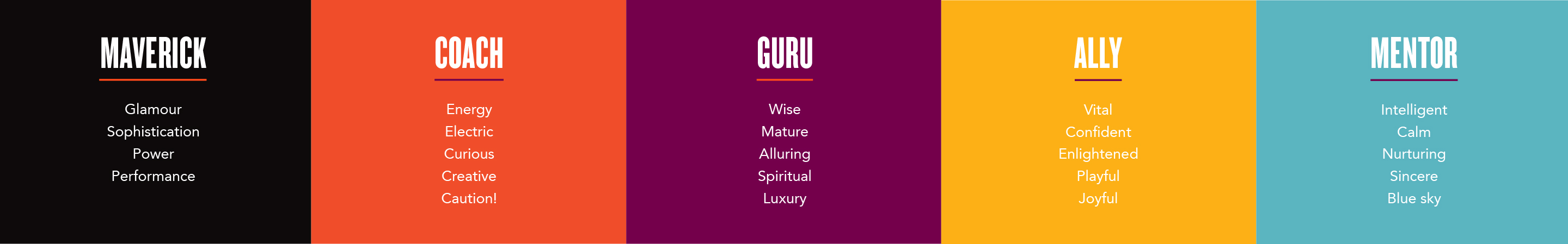
The colour palette is considered with respect for symbolism and aesthetic, with shades named after different types of teachers.
Copy that
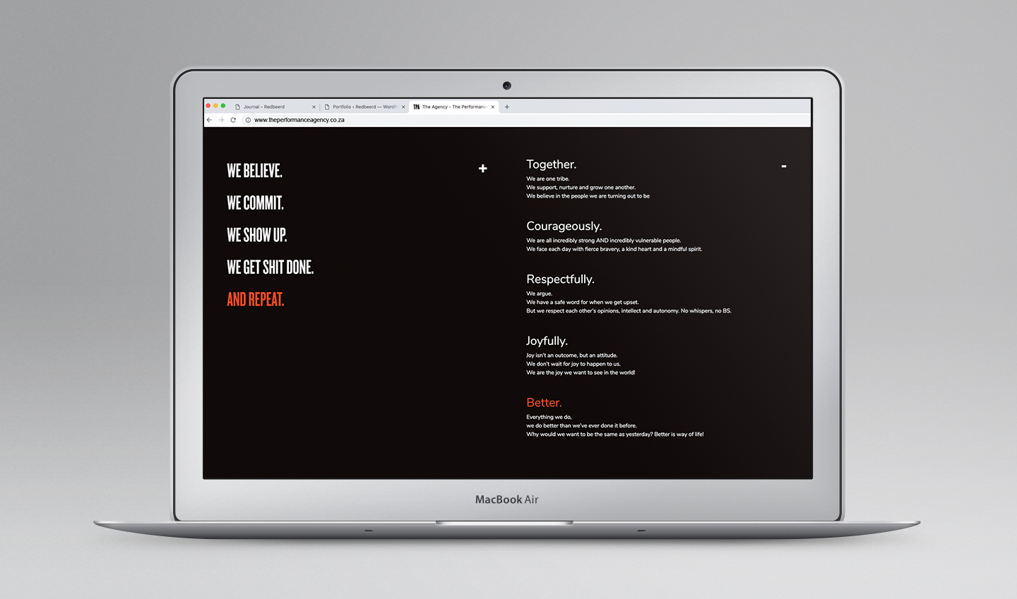
Verbal brand tone was invigorated; a provocative tone that asserts and questions. Direct content that digs into the good stuff, using narrative to communicate grand vision, complex offerings and precious Core Beliefs.
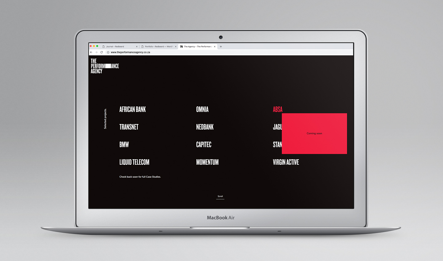
Co-creator
TPA partners and facilitates, sometimes taking a visible lead, and other times remaining in the wings. The aperture allows TPA to acknowledge their clients, reflecting them within their own logo.