Tandem Liber Holdings
Brand Development
Redbeerd
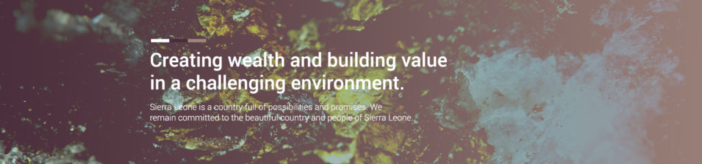
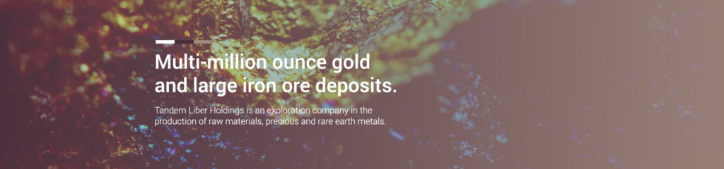
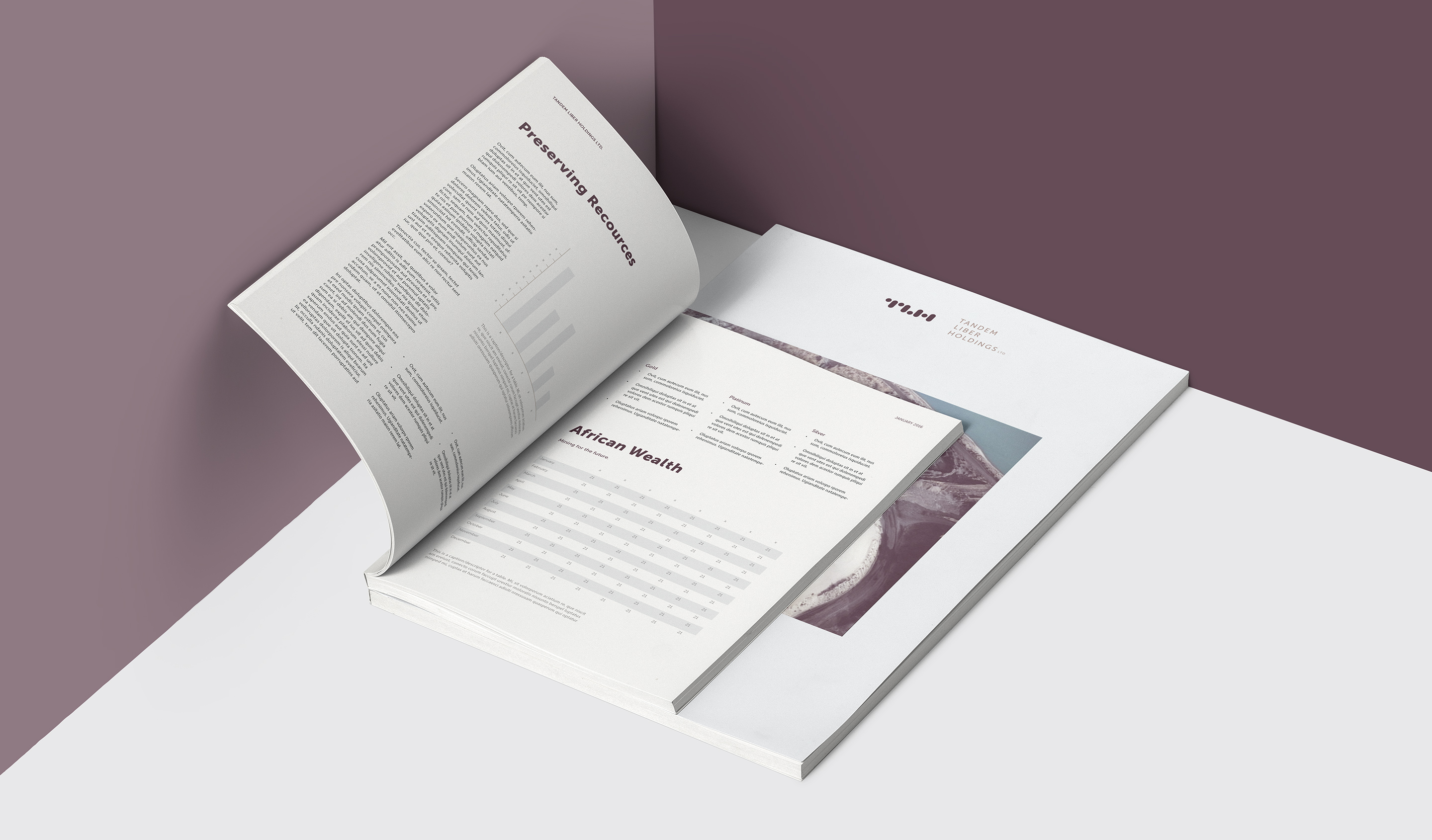
Tandem Liber Holdings is a mining and exploration company, with a focus on rare earth minerals and precious metal. The brand mirrors this rarity, with an exclusive colour palette and pared down visual language. Atypical, expert, beautiful.
![](https://www.redbeerd.co.za/wp-content/uploads/2018/12/Tandem-design.jpg)
![](https://www.redbeerd.co.za/wp-content/uploads/2018/12/Tandem-stationery-design-and-CI.jpg)
![](https://www.redbeerd.co.za/wp-content/uploads/2018/12/Tandem-Logo-design.jpg)
![](https://www.redbeerd.co.za/wp-content/uploads/2018/12/Tandem-logo-and-business-card-design.jpg)
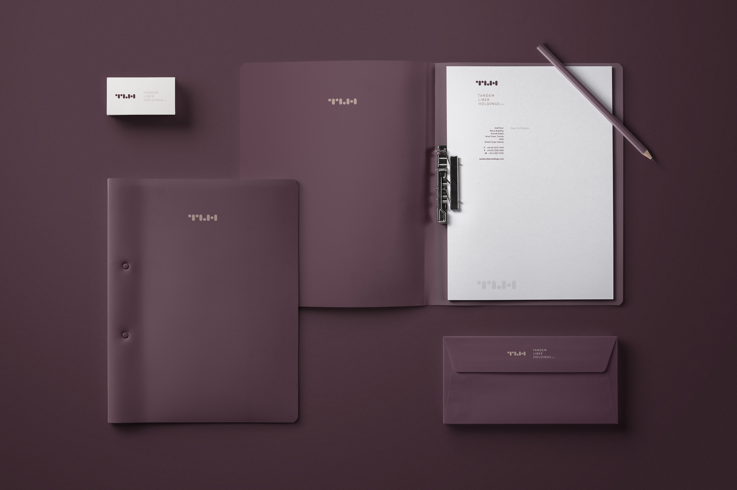
The logomark is an almost-abstract typographical TLH. The basic shapes make gentle reference to the explorative aspects of Tandem Liber Holdings’ business; observing digging, receiving.
![](https://www.redbeerd.co.za/wp-content/uploads/2018/12/Envelope-design.jpg)
![](https://www.redbeerd.co.za/wp-content/uploads/2018/12/Brochure-design-cover.jpg)
![](https://www.redbeerd.co.za/wp-content/uploads/2018/12/Brochure-design.jpg)
![](https://www.redbeerd.co.za/wp-content/uploads/2018/12/Tandem-logo-design-2.jpg)