o’halo
Brand Strategy
Redbeerd
Brand Development
Redbeerd
Naming, Tagline, Copywriting
Redbeerd
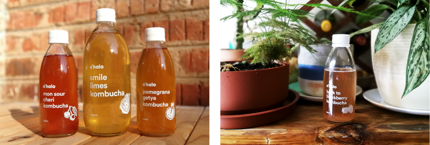
Packaging
Redbeerd
Martine and Shawn started brewing kombucha in their own kitchen. Soon, there was more than they could ever drink and friends and family were requesting flavours. Now o’halo kombucha is stocked in stores around the country, along with their signature health-full muesli, snacks and desserts.
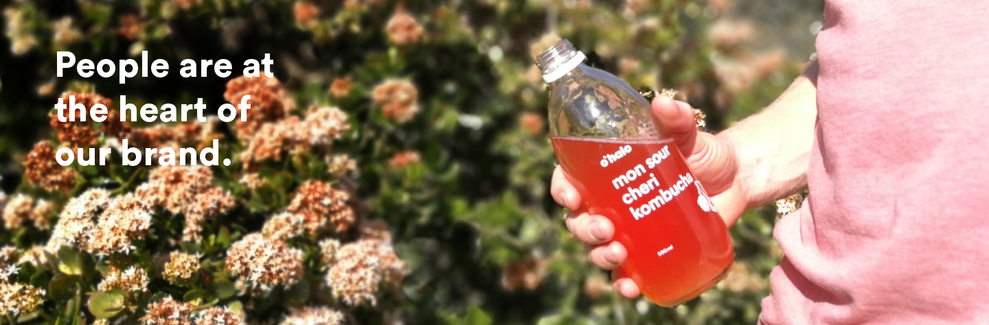
Hand-crafted, locally-sourced, people-conscious.
Working together we discovered o’halo’s reasons for why they love to do what they do. We delved into the (booming!) health food industry and unearthed nuggets of interest and insight. Via a brand strategy we established core brand values that would guide o’halo’s brand development, from naming to packaging.
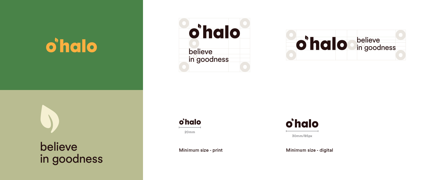
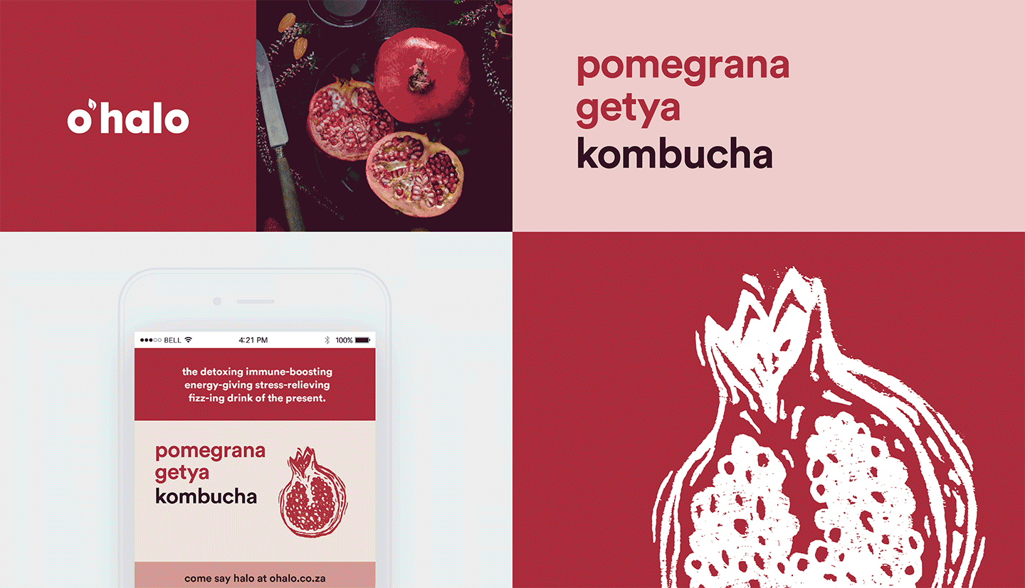
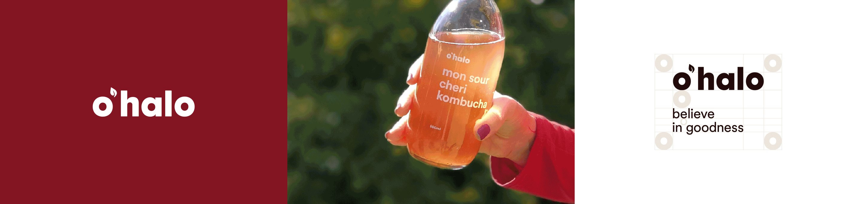
o’halo = ‘oh, hello’
Friendly and optimistic, o’halo reflects the bright sunshine and smiley people of Southern Africa.
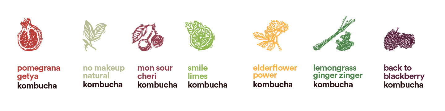
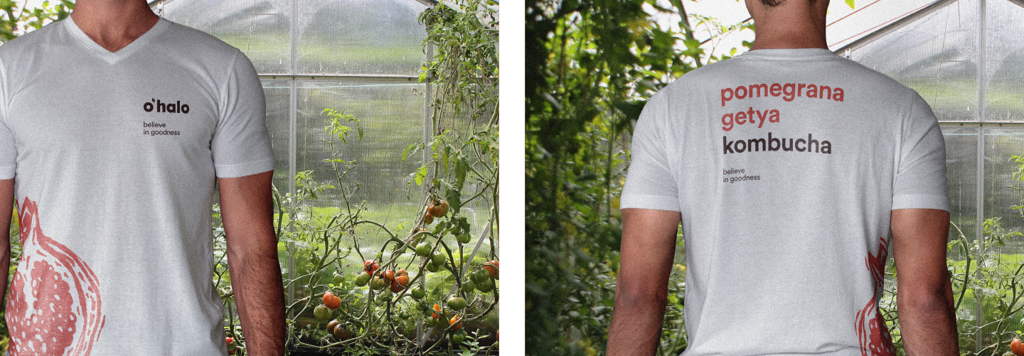
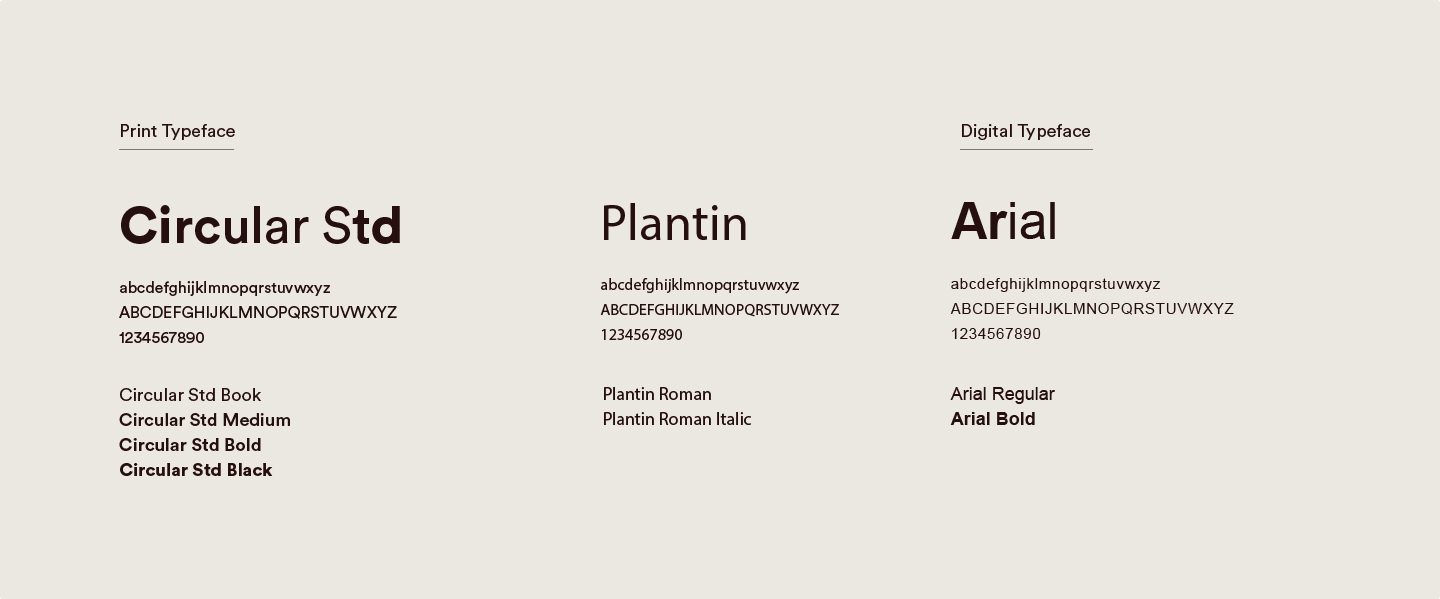
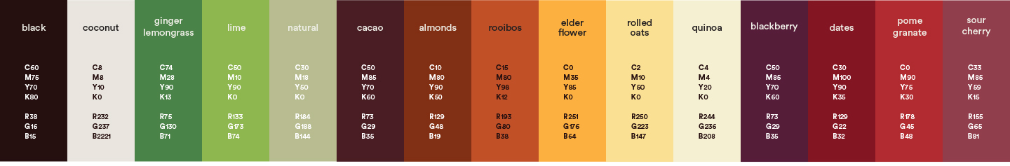
Sweet, rounded letterforms form the logotype. Capitals are rarely, if ever, used. The colour palette is bright and rich, inspired by local and fresh ingredients. Illustrations are hand-drawn and imperfect. The tagline believe in goodness expresses o’halo’s positivity and hope for the future of South Africa, health and the environment.